Open topic with navigation
Reports
Monsoon offers you a wide range of reporting tools. Using these tools will allow you to see how your business is performing.

Report Data Freshness
Inventory report data is updated periodically throughout the day. Very large inventories (i.e., inventories containing more than 75,000 active SKUs) may see a lag time of three to six hours between changes in inventory and changes in report accuracy.
This lag time will be affected by various factors such as processor speed and available memory (RAM).
Orders report data is updated in near real-time.
Historical report data (data for days past) will be stored as a single snapshot of available report data just prior to midnight, local system time.
Report Screen Components
Report Type
Your Monsoon software supports a wide range of reporting features.
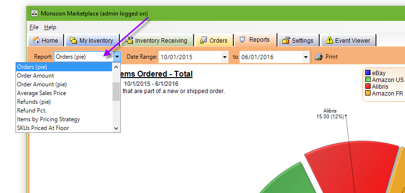
Click the Report drop-down menu to select a report type.
Interval
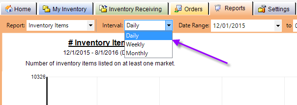
The Interval specifies the frequency with which you want to analyze your data.
- Daily — Shows the final totals for a given 24 hour period (midnight to midnight).
- Weekly — Calendar week = average of daily values during the selected period.
- Monthly — Calendar month = average of daily values during the selected period.
Note:
For reports showing Receiving activities, totals will be a sum of all quantities received for the given period.
- Receive totals do not take into account the number of items imported.
- Only items physically received are shown.
Date Range
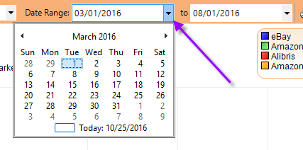
To select a Date Range for your report,
- Click on each of the drop-down calendars,
- Select your start date,
- Select your end date.
Your report will appear dynamically on the screen as you adjust your date range.
Color Components
Your reports are color-coded to show performance across your active markets as well as all available markets.
- Each market that you have enabled in Monsoon—including custom markets using Data Exchange—will appear as a component in each of your reports.
- In the bar graphs, a “Total” component will appear, as well.
- Hovering your mouse pointer over a component in your report will reveal the numerical value that is being visually represented.
Print
It is easy to print hard copies of your reports.
The report will print exactly as you see it on the computer screen.
- Select your report type and date range.
- Click the Print button.
The type of report you have selected and your selected date range will always appear on your report output.
Descriptions of Report Content
Inventory SKUs (bar graph)
This report shows a tally of all active, unique items (i.e., SKUs) that were listed on each of your enabled marketplaces within the specified date range.
- Market = number of SKUs listed online for each enabled market.
- Total = number of SKUs listed online, regardless of market.
Inventory Items (bar graph)
This is a tally of the total listed quantity of online SKUs that you currently have listed within the specified date range (i.e., The number of actual items you are showing as “available” online).
- Market = total available quantity of items listed on that market.
- Total = available quantity of items across all enabled markets for all listed SKUs.
Inventory Value (bar graph)
Here you will find the approximate value of inventory listed per marketplace within the specified date range.
- Market = sum of listed available quantity multiplied by the listed price for each item. These are then summed for each enabled market.
- Total = sum of all available quantities multiplied by the highest listed price for each item, summed across all markets.
Unique Items
This report exposes the number of unique items you have in inventory.
- Unique items are items sharing the same Product ID (ISBN, UPC or ASIN)
- SKU is not considered for this report.
- Condition is ignored for the purposes of this report.
This report shows you how many Orders (bar graph)
This report shows a tally of the number of items sold per marketplace.
- Market = sum of shipped quantity on all orders for each day within the specified date range.
- New & shipped orders only
- Canceled orders are excluded from this count.
- Total = sum of all Market values, as described above.
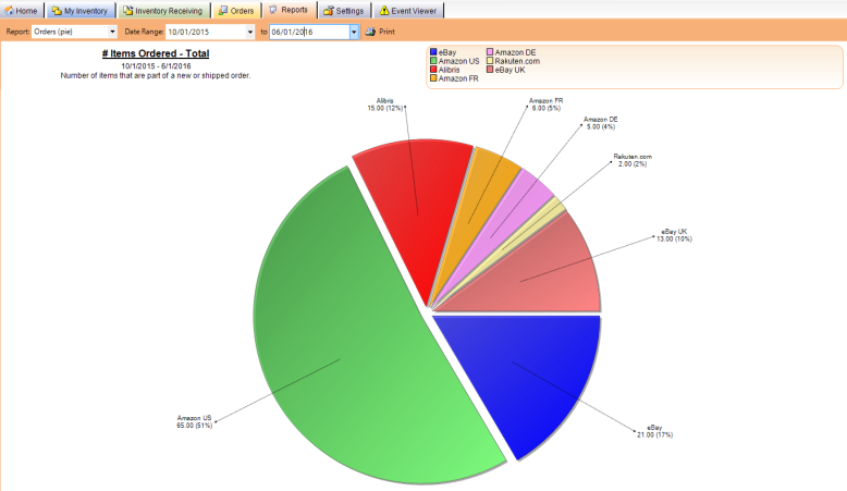
Orders (pie)
Shows the total number of items and percentage of total items sold per marketplace.
Market = sum of shipped quantity on all orders for each day within the specified date range.
New & shipped orders only;
Canceled orders are excluded from this count.
Order Amount (bar graph)
Simple tally of the value of all orders sold per marketplace.
- Market = sum [price + shipping fee]
- New & shipped orders only
- Canceled orders are excluded from this count.
- Total = sum of all Market values, as described above.
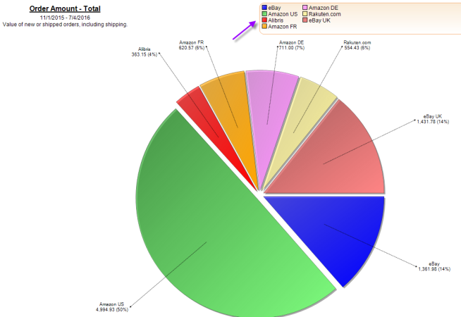
Order Amount (pie chart)
Shows the total value and percentage of total orders sold across all active marketplaces.
- Market = sum [price + shipping fee]
- New & shipped orders only
- Canceled orders are excluded from this count.
Average Sales Price (bar graph)
Tally of your average sales price for the specified date range.
- Market = average price point per item per interval for the specified market
- New & shipped orders only, including shipping.
- Canceled orders are excluded from this count.
- Total = average price point per item per interval for all enabled markets (i.e., total sales).
- New & shipped orders only, including shipping;
- Canceled orders are excluded from this count.
Refunds (pie chart)
Shows your Refund Rate as a percentage per online market.
- Refund Rate equals the number of refunds per market per total refunds over your specified date range.
- Any canceled order is counted as a refund.
Refund Percentage (bar graph)
Tally of total refund percentages per marketplace for the selected date range.
- Market = total number canceled orders per total number of orders for the specified market within the selected date range.
- Total = total number canceled orders per total number of orders across all enabled markets within the selected date range.
Top SKUs (bar graph)
This report shows the 500 SKUs with the most sales velocity over the selected date range.
- Ranked by quantity shipped.
- Simply the sum of each SKU’s shipped quantity.
Top SKUs by Amount (bar graph)
Shows the top 500 SKUs
- Ranked by sum of order amounts.
- Sum of order amounts = [item price + shipping] shipped quantity.
Single SKU (bar graph)
Shows the sum of the shipped quantity for any given SKU.
- Specific SKUs are manually entered.
Single SKU by Amount (bar graph)
Sum of price + shipping fees for any given SKU.
- Specific SKUs are manually entered.
Received (bar graph)
This shows the number of times a user has accepted items into inventory during the selected time period.
- Quantities received are ignored.
- Only a tally of the times the user has clicked on “OK” to receive to a SKU.
Received (pie chart)
This report gives a view of the performance of all Receivers gauged as percentages of total receiving activity.
- Quantities received are ignored.
- Based on a simple tally of the number of times users have clicked on “OK” to receive items.
Inventory Age
See Inventory Age and Days Since First Received.
SKUs Priced at Floor
Shows a simple pie graph showing the number and percentage of inventory that has been priced at the floor.
- Price Floor = Cost of Goods + Profit
Inventory by Sales Rank
Presents a simple pie chart, breaking down the percentages of your inventory by current Sales Rank.
Order Items by Sales Rank
Presents a simple pie chart, breaking down the percentages of your items sold by their Sales Ranks at the time they sold.
Orders and Inventory Items by Sales Rank
Presents two graphs in a single chart.
- The left side shows the number of current inventory items (per SKU).
- The right side shows the number of ordered items.
- The bottom line shows the Amazon Sales Rankings broken down into various ranges.
Items by Pricing Strategy
Displays an item's pricing strategy by fulfillment type where each item's fulfillment type counts as a unique entry.
For example, let's say that you have just one book in your inventory. Now, lets say that the book is locally fulfilled only and you apply a pricing strategy called Local Pricing. The report displays the item as Local Pricing 1 (100%).
Now, let's say that you receive another copy of the book, but you send it to FBA and apply a pricing strategy called FBA Pricing. The report displays the items as Local Pricing 1 (50%), FBA Pricing 1 (50%).
©2016 Monsoon, Inc. All rights reserved.
